For every DOOH ad campaign executed, advertisers and marketers everywhere need to know one thing above all else – what drives campaign performance?
Is it high reach or precise targeting? How important is contextual relevancy, campaign budget, and creative quality?
Thankfully, those questions have been answered by a number of research papers over the years – and top-quality creative has persisted as the most important factor, accounting for 47% of sales lift, according to Nielsen.
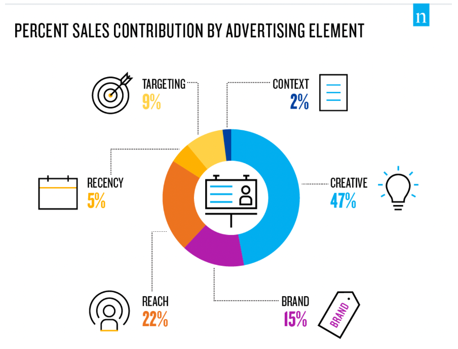
(Image source: nielsen.com)
A separate study by Kantar concurs with these findings. It found that creative quality accounts for 50% of the effectiveness of an ad campaign, making it, the report notes, “the single largest driver of brand impact” (brand size aside, which was discovered to be the biggest multiplier of campaign effectiveness).
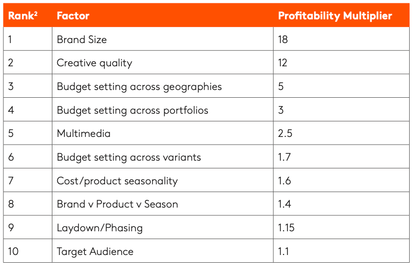
(Image source: kantar.com)
Clearly, creative quality is what marketers need to focus on to drive the effectiveness of their DOOH advertising campaigns. Why? Because good DOOH design leads to a boost in sales.
In this article, we’ll be taking a look at five important DOOH design tips to help you get the most out of your next digital out of home campaign. We’ll also explore the brand new DOOH Design Studio from The Neuron, and how you can use its professionally created DOOH design templates to get your DOOH campaigns crafted and launched within minutes.
Top DOOH Design Tips for Digital Billboards and Other Digital Signage
1. Keep Your Message Short and Sweet
Research from the Outdoor Advertising Association of America (OAAA) reveals that roughly two-thirds (62%) of consumers notice digital billboards each month. However, most of those viewings are fleeting – lasting only between about five and ten seconds as people whizz past in cars, buses, motorbikes, or trains.
As such, it’s essential that you keep messages on your DOOH campaign displays as concise as possible.
Short, simple words which are quick to read and easy to comprehend are the order of the day, and there should be as few of them as possible – about seven or less is a good rule of thumb.

(Image source: clearchanneloutdoor.com)
2. Choose Readable Fonts, Bold Colors, and Single Images
Again, these rules are especially applicable to digital billboard campaigns – although they also hold true when utilizing other types digital out of home media.
Let’s begin with fonts.
The first tip is use to sans serif fonts – that is, fonts without serifs, which are those little embellishments on the end of letter strokes in certain types of typography.
Similarly, avoid italic fonts, gothic fonts, or any font that is overly decorative and difficult to read. Instead, go for fonts that are large, bold, clear, without serifs or embellishments, and can be read easily from a distance.
When it comes to color, what you’re aiming for is contrasting color combinations that make messages easy to read. To this end, avoid light fonts on white backgrounds, blue text on red or dark backgrounds, and other color combinations that make text hard to read.
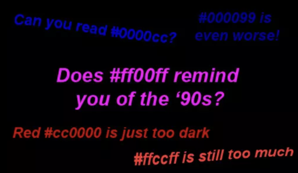
(Image source: sitepoint.com)
When it comes to images, less is more. Don’t clutter up your ad with lots and lots of pictures of different things – like your entire range of products. Just one image with a one or two focal points is ample, as this helps the viewer digest the entire ad quickly. Another great tip is to feature a small object and make it big (like a piece of jewelry) rather than a large object (like a cityscape) and make it small.
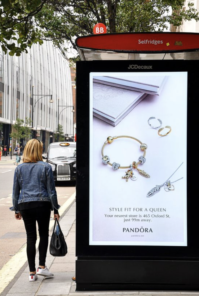
(Image source: google.com)
3. Add a Live Data Feed for Dynamic Creative
With today’s powerful programmatic digital out of home (pDOOH) platforms, it’s now possible to add contextual relevancy to your digital outdoor ads based on external data.
Examples of ways to incorporate this type of DOOH design into your campaigns include weather data (temperatures, forecasts, storm trackers, etc.), air quality ratings, queue wait times, the current score line from a local or national sporting event, or, as in this great example below, the pollen count.
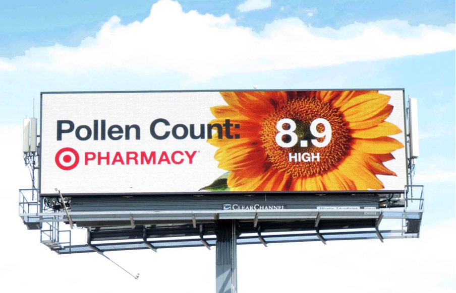
(Image source: clearchanneloutdoor.com)
4. Incorporate Humor and Appeal to Target Localities
Another way to add contextual relevancy to your digital OOH campaigns is to customize each DOOH design based on location. This can be particularly effective if you utilize the location’s well-known characteristics – and incorporate a little humor.
Humorous outdoor ad campaigns are often the most memorable. This is because they elicit an emotional response in the viewer, whilst still sending a clear message about the brand or product being advertised.
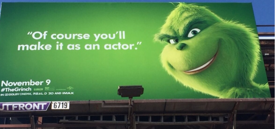
This type of location + humor DOOH advertising campaign was used to great effect during the national promotion of the movie The Grinch. The infamously snarky Dr Seuss character appeared on digital signage in major cities sneering location-based one-liners at the locals.
Broadway patrons lining up for theatre tickets in New York City, for instance, were greeted with the Grinch mockingly telling them “Good luck getting those Hamilton tickets.”
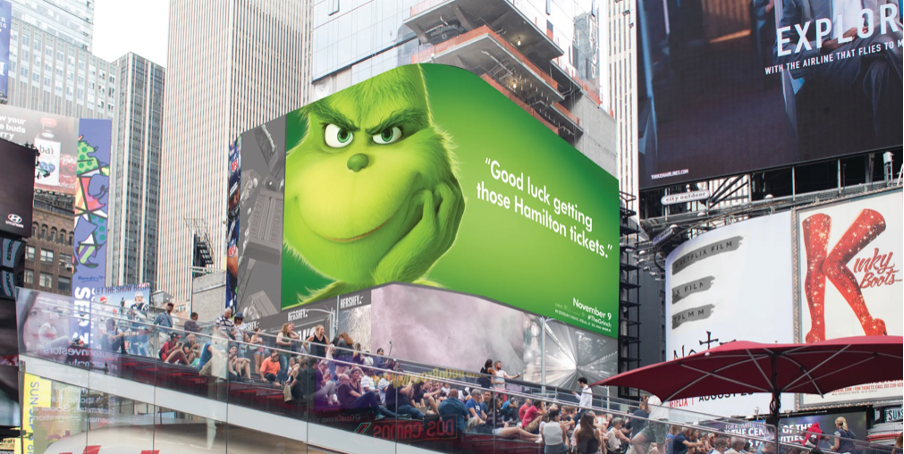
(Image source: usatoday.com)
Chicago folks, meanwhile, had a looming Grinch saying, “I’ve seen windier cities.”
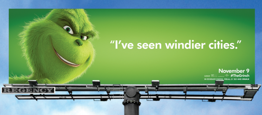
(Image source: usatoday.com)
In Los Angeles, aspiring movie stars ran into a particularly cruel jibe from the Grinch – “Of course you’ll make it as an actor.”
(Image source: google.com)
5. Use the Free DOOH Design Studio from The Neuron
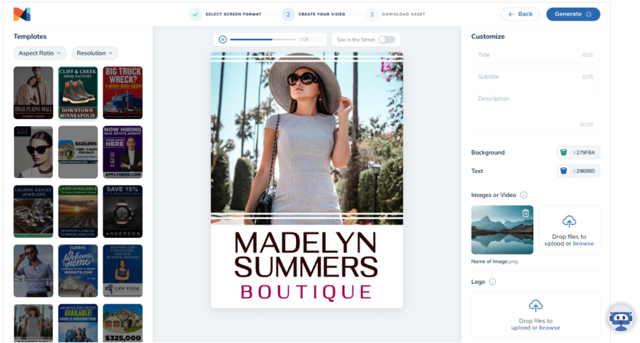
If you’re looking to create the best DOOH designs for your next advertising campaign, then the best advice we can offer is to use the free DOOH Design Studio from The Neuron.
The DOOH Design Studio is a specialist design studio for digital signage.
100% free to use, the DOOH Design Studio comes with hundreds of ready-to-use vertical-specific templates that have been designed by DOOH advertising experts using proven techniques to maximize effectiveness and ad recall.
(Image source: theneuron.com)
Simply pick your template, then add your logo and customize the text, font, color, and you’re good to go.
You can then use The Neuron pDOOH platform to find the perfect screens on which to display your campaigns and track their performance with real-time data and analytics.
With The Neuron, you can have your next (or your first!) digital out of home campaign designed and published in minutes – even if you’re a complete beginner.

